Mirza Jali
Persian Typeface,Type Family,TypeFace
Bold typefaces are commonly designed from regular weight. The main function of those is typing titles. Hence they’re not appropriate to use them on text in small sizes, such as books. In calligraphy, the word ‘Jali Nevisi’ is used for writing inscriptions. For instance, Inscriptions on the ‘Sepahsalar mosque’ is attributed to ‘Mirza Gholam-Reza Esfahani’, or Inscriptions on the ‘Negarestan garden palace’ including the ‘Sa’di’ and the ‘Ferdowsi’ poems are attributed to the ‘Emad-ol-Kottab’ which are classified as ‘Jali Nevisi’ for this particular size.
‘Jali’ in the Dehkhoda Dictionary means bold. In the Persian language and in typographic context, bold can be replaced with ‘Jali’ both in function and meaning.
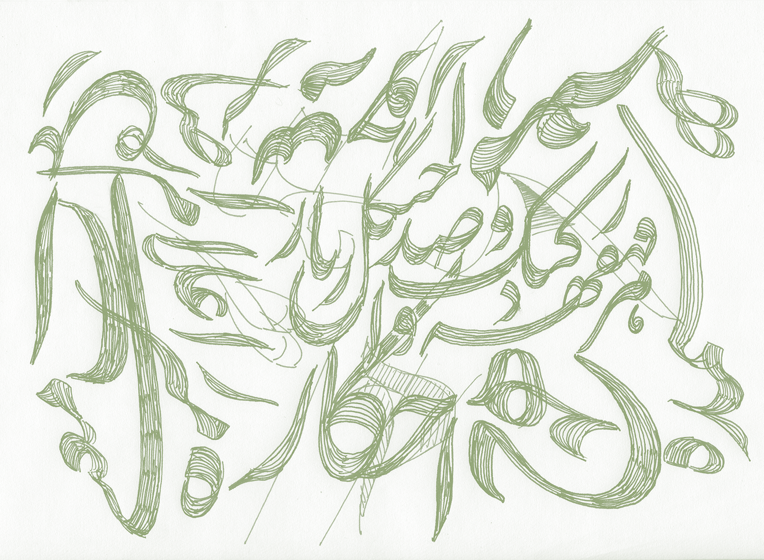
The Mirza typeface has been designed based on the writings of the ‘Mirza Gholam-Reza Esfahani’ –one of the most celebrated Persian calligraphers of the Qajar era. This typeface is the result of an extensive study on the best specimens of the Mirza Gholam-Reza’s work, from the last decade of his life. Mirza typeface was released one year ago. This typeface has been used in billboard advertisements in the city during the last year. However, Mirza is designed for middle-sized texts rather than city billboards.
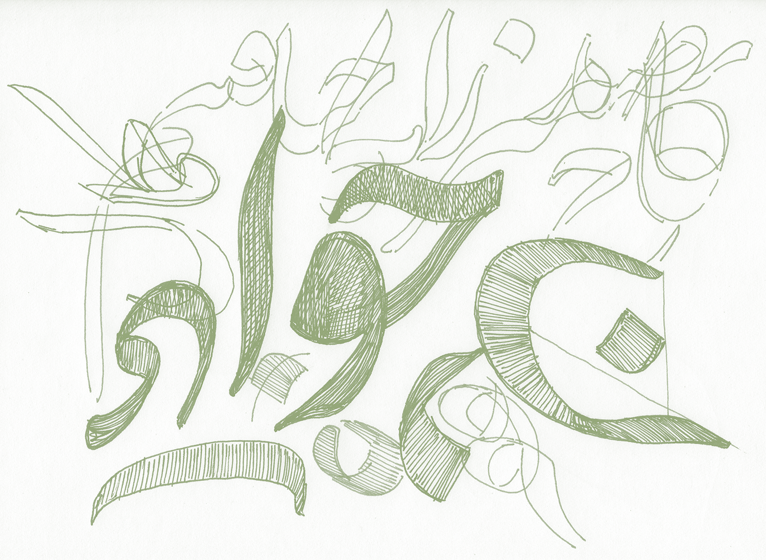
Bold weight-‘Jali’ as I said- for Mirza typeface is designed as a solution for writing texts in large sizes. Although letters in ‘Mirza Jali’ are drawn based on the regular weight, some drawing details have been simplified to avoid visual noises. In the near future, Light weight of Mirza whose name is “Khafi”, will be added to Mirza type family.